Predicting Cab Supply and Demand(Cab Booking System)
- Codersarts AI

- Sep 10, 2020
- 5 min read
About the project:
Cab booking system is the process where renting a cab is automated through an app throughout a city. Using this app, people can book a cab from one location to another location. Being a cab booking app company, exploiting the understanding of cab supply and demand could increase the efficiency of their service and enhance the user experience by minimizing waiting time.
Objective of this project is to combine historical usage patterns along with open data sources like weather data to forecast cab booking demand in a city.
You will be provided with an hourly renting data span of two years. Data is randomly divided into train and test sets. You must predict the total count of cabs booked in each hour covered by the test set, using the information available prior to the booking period. You need to append the train_label dataset to train.csv as the ‘Total_booking’ column.
Please find the descriptions of the columns present in the dataset below.
datetime - hourly date + timestamp season - spring, summer, autumn, winter
holiday - whether the day is considered a holiday
workingday - whether the day is neither a weekend nor holiday
weather - Clear , Cloudy, Light Rain, Heavy
temp - temperature in Celsius
atemp - "feels like" temperature in Celsius
humidity - relative humidity
windspeed - wind speed
Total_booking - number of total booking
DATASET
The recommended datasets will be shared. You can download them from the LMS
TASKS
Following are the tasks, which need to be developed while executing the project:
Task 1:
1. Visualize data using different visualizations to generate interesting insights.
2. Outlier Analysis
3. Missing value analysis
4. Visualizing Total_booking Vs other features to generate insights
5. Correlation Analysis
Task 2:
1. Feature Engineering
2. Grid search
3. Regression Analysis
4. Ensemble Model
Solution:
Task 1:
import pandas as pd

# Here, I have append the rows of train dataset and test dataset
df11=pd.read_csv('C:/Project_1_dataset/Dataset/train.csv')
df111=pd.read_csv('C:/Project_1_dataset/Dataset/test.csv')
df1=df11.append(df111,ignore_index=True)

# Here, I have append the rows of train_label dataset and test_label dataset
df22=pd.read_csv('C:/Project_1_dataset/Dataset/train_label.csv', header=None, names=['Total_Booking'])
df222=pd.read_csv('C:/Project_1_dataset/Dataset/test_label.csv', header=None, names=['Total_Booking'])
df2=df22.append(df222,ignore_index=True)

# Here, I have Concatenate the columns of df1 and df2 dataset to get complete dataset.
df = pd.concat([df1, df2], axis=1)
df1=df
you can change the path and add your own path where you can add these train and test datasets.
# here, I have drop the duplicates rows from the dataset df.
df=df.drop_duplicates()
df
Identifying Missing Values
# Here, I have checked the Missing value in the dataset
df.isnull().sum()
Output:
datetime 0 season 0 holiday 0 workingday 0 weather 0 temp 0 atemp 0 humidity 0 windspeed 0 Total_Booking 0 dtype: int64
# Here, I have checked the datatype of the given Columns.
df.dtypes
Output:
datetime object season object holiday int64 workingday int64 weather object temp float64 atemp float64 humidity int64 windspeed float64 Total_Booking int64 dtype: object
Outliers Analysis
#Here, I have checked the outliers in the windspeed column through the boxplot graph.
import seaborn as sns
sns.boxplot(x=df['windspeed'])
#Here, I have checked the outliers in the Humidity column through the boxplot graph.
import seaborn as sns
sns.boxplot(x=df['humidity'])
As like above, you can get all outliers of each dataset columns:
# Here, I have checked the outliers in the windspeed vs Total_Booking column through the scatter graph.

import matplotlib.pyplot as plt
import matplotlib
fig, ax = plt.subplots(figsize=(16,8))
ax.scatter(df['windspeed'], df['Total_Booking'])
ax.set_xlabel('Wind Speed')
ax.set_ylabel('Total Booking')
plt.show()
Output:

# Here, I am finding the zscore values of the numerical columns of the dataset df.
from scipy import stats
import numpy as np
z = np.abs(stats.zscore(df[['windspeed','temp','atemp','humidity','Total_Booking']]))
print(z)
Output:
[[0.5142603 0.24503701 0.24839078 0.78535767 1.7248125 ] [0.75963759 1.08700912 1.14227927 0.88928536 1.03002161] [1.12729319 1.85989326 2.07630932 0.61766615 0.29024652] ... [0.8819159 0.17594904 0.10975464 0.14999154 0.17983232] [0.46560752 0.38644207 0.28853234 1.66874304 0.89752458] [0.5142603 1.29750214 1.32105696 0.21375537 0.1790138 ]]
# Here, I have checked where thresold is greater than 3.
threshold = 3
print(np.where(z > 3))
# Here, I have drop the rows where zscore is less than 3 to remove the outliers of the dataset df
df = df[(z < 3).all(axis=1)]
# After removing the outliers, The dataset df is :
df
Output:

# Here, You have to see in the boxplot graph that maximum outliers are remove from the windspeed column. Only three left
import seaborn as sns
sns.boxplot(x=df['windspeed'])
Output:

As like above, you can remove all outliers from other columns.
Visualize data using different visualizations to generate interesting insights.
# Show value counts for a weather Column of dataset df_o:

import matplotlib.pyplot as plt
import seaborn as sbn
sbn.countplot(x='weather',data=df)
plt.xticks(rotation=90)
plt.show()
Output:

# Show value counts for a season Column and weather Column of dataset df_o:
import seaborn as sbn
sbn.countplot(x='season',data=df,hue='weather')
plt.show()
Output:

# Show value counts for a season Column and Holiday Column of dataset df_o where 0 value represent No Holiday and 1 value represent Holiday:

import seaborn as sbn
sbn.countplot(x='season',data=df,hue='holiday')
plt.show()
Output:

# Show value counts for a season Column and WorkingDay Column of dataset df_o where 0 value represent No WorkingDay and 1 value represent WorkingDay:

import seaborn as sbn
sbn.countplot(x='season',data=df,hue='workingday')
plt.show()
Output:

# Here, I have draw the Pie chart between HoliDay, WorkingDay And No Holiday No Workingday to check the status in percentile.

Not_Holiday_Not_workingday=df[(df.holiday==0) & (df.workingday==0)].shape[0]
print('No working and No Holiday = ', Not_Holiday_Not_workingday)
Holiday=df[(df.holiday==1)].shape[0]
print('Total HoliDay = ', Holiday)
WorkingDay=df[(df.workingday==1)].shape[0]
print('Total Working Day = ', WorkingDay)
plt.pie(x=[Not_Holiday_Not_workingday,WorkingDay,Holiday],labels=['No Holiday & No workingday','WorkingDay','Holiday'],explode=(.1,.1,.1),colors=['g','r','b'],autopct='%.2f',wedgeprops={'edgecolor':'k'})
plt.show()
Output:

Fetch specified value from dataset column value
#Here, I have fetch the Months from the datetime column
df1['booking_month'] = pd.to_datetime(df1.datetime, format='%m/%d/%Y %H:%M').dt.month_name()

#Here, I have fetch the Days from the datetime column
df1['booking_day'] = pd.to_datetime(df1.datetime, format='%m/%d/%Y %H:%M').dt.day_name()

#The time of departure is in 24 hours format(22:20), we would like to bin it to get insights.
#Here, I have decided to group hours into 4 bins. [0–5], [6–11], [12–17] and [18–23] are the 4 bins.
df1['timing'] = pd.to_datetime(df1.datetime, format='%m/%d/%Y %H:%M')
a = df1.assign(dept_session=pd.cut(df1.timing.dt.hour,[0,6,12,18,24],labels=['Night','Morning','Afternoon','Evening']))
df1['booking_session'] = a['dept_session']

#Here, I have fetch the Year from the datetime column
l2=[]
for i in range(0,df1.shape[0]):
    l2.append(df1.datetime[i][df1.datetime[i].rindex('/')+1:df1.datetime[i].rindex('/')+5])
df1['year']=pd.DataFrame(l2,columns=['year'])

df1
Output:

# Show value counts for a Months Column of dataset df.
import matplotlib.pyplot as plt
import seaborn as sbn
sbn.countplot(x='booking_month',data=df1)
plt.xticks(rotation=90)
plt.show()
Output:

# Show value counts for a Day Column of dataset df.
import matplotlib.pyplot as plt
import seaborn as sbn
sbn.countplot(x='booking_day',data=df1)
plt.xticks(rotation=90)
plt.show()
Output:

# Show value counts for a Year Column and  booking_session column of dataset df.
import matplotlib.pyplot as plt
import seaborn as sbn
sbn.countplot(x='year',data=df1,hue='booking_session')
plt.xticks(rotation=90)
plt.show()
Output:

Visualizing Total_booking Vs other features to generate insights
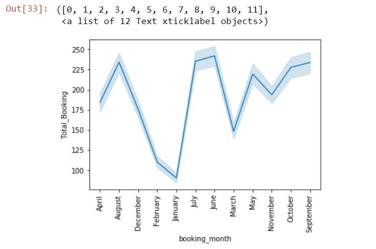
# Show the Line Plot Between booking_Month vs Total_Booking column
import matplotlib.pyplot as plt
import seaborn as sbn
sbn.lineplot(x="booking_month", y="Total_Booking", data=df)
plt.xticks(rotation=90)
Output:
# Show the Line Plot Between booking_day vs Total_Booking column.
import matplotlib.pyplot as plt
import seaborn as sbn
sbn.lineplot(x="booking_day", y="Total_Booking", data=df)
plt.xticks(rotation=90)
Output:

Correlation Analysis:
df.corr('spearman')
Task 2 :
Feature Engineering
import pandas as pd

# Here, I have append the rows of train dataset and test dataset
df11=pd.read_csv('C:/Project_1_dataset/Dataset/train.csv')
df111=pd.read_csv('C:/Project_1_dataset/Dataset/test.csv')
df1=df11.append(df111,ignore_index=True)

# Here, I have append the rows of train_label dataset and test_label dataset
df22=pd.read_csv('C:/Project_1_dataset/Dataset/train_label.csv', header=None, names=['Total_Booking'])
df222=pd.read_csv('C:/Project_1_dataset/Dataset/test_label.csv', header=None, names=['Total_Booking'])
df2=df22.append(df222,ignore_index=True)

# Here, I have Concatenate the columns of df1 and df2 dataset to get complete dataset.
df = pd.concat([df1, df2], axis=1)
df
Output:

# Here, I have checked the datatype of the given Columns.
df.dtypes
Output:
datetime object season object holiday int64 workingday int64 weather object temp float64 atemp float64 humidity int64 windspeed float64 Total_Booking int64 dtype: object
Contact us to get a complete solution or need any other related machine learning project help, then you can contact us at below contact detail: contact@codersarts.com


Comments