Exploring Data Visualisation using Matplotlib and Seaborn
- Jan 15, 2021
- 11 min read
In this blog we will be exploring visualisation of data using matplotlib and seaborn.
Before we start let us discuss about Matplotlib and Seaborn.
Matplotlib was introduced by John Hunter in 2002. It is the main visualisation library in Python, all other libraries are built on top of matplotlib.
The library itself is huge, with approximately 70,000 total lines of code and is still developing. Typically it is used together with the numerical mathematics extension: NumPy. It contains an interface "pyplot" which is designed to to resemble that of MATLAB.
We can plot anything with matplotlib but plotting non-basic can be very complex to implement. Thus, it is advised to use some other higher-level tools when creating complex graphics.
Coming to Seaborn: It is a library for creating statistical graphics in Python. It is built on top of matplotlib and integrates closely with pandas data structures. It is considered as a superset of the Matplotlib library and thus is inherently better than matplotlib. Its plots are naturally prettier and easy to customise with colour palettes.
The aim of Seaborn is to provide high-level commands to create a variety of plot types that are useful for statistical data exploration, and even some statistical model fitting. It has many built-in complex plots.
First we will see how we can plot the same graphs using Matplotlib and Seaborn. This would help us to make a comparison between the two.
We will use datasets available in the Seaborn library to plot the graphs.
some useful links:
choosing colormaps in matplotlib: https://matplotlib.org/3.1.0/tutorials/colors/colormaps.html
list of named colors in matplotlib: https://matplotlib.org/3.1.0/gallery/color/named_colors.html
color demo: https://matplotlib.org/3.2.1/gallery/color/color_demo.html
markers in matplotlib: https://matplotlib.org/3.3.3/api/markers_api.html
choosing color palettes in seaborn: https://seaborn.pydata.org/tutorial/color_palettes.html
Scatterplot
For this kind of plot we will use the Penguin dataset which is already available in seaborn. The dataset contains details about three species of penguins namely, Adelie, Chinstrap and Gentoo.
Matplotlib code:
plt.figure(figsize=(14,7))
plt.scatter('bill_length_mm', 'bill_depth_mm', data=df,c='species',cmap='Set2')
plt.xlabel('Bill length', fontsize='large')
plt.ylabel('Bill depth', fontsize='large');
We have plotted the bill length against the bill depth. Bill refers to the beak of penguins. They are of various shapes and sizes and vary from species to species. Clearly in the above graph we can't make out which data belongs to which species. This is due to Matplotlib being unable to produce a legend when a plot is made in this manner.
Let us now plot the same graph along with the legend.
Matplotlib code:
plt.rcParams['figure.figsize'] = [15, 10]

fontdict={'fontsize': 18,
          'weight' : 'bold',
         'horizontalalignment': 'center'}

fontdictx={'fontsize': 18,
          'weight' : 'bold',
          'horizontalalignment': 'center'}

fontdicty={'fontsize': 16,
          'weight' : 'bold',
          'verticalalignment': 'baseline',
          'horizontalalignment': 'center'}

Adelie = plt.scatter('bill_length_mm', 'bill_depth_mm', data=df[df['species']==1], marker='o', color='skyblue')
Chinstrap = plt.scatter('bill_length_mm', 'bill_depth_mm', data=df[df['species']==2], marker='o', color='yellowgreen')
Gentoo = plt.scatter('bill_length_mm', 'bill_depth_mm', data=df[df['species']==3], marker='o', color='darkgray')

plt.legend(handles=(Adelie,Chinstrap,Gentoo),
           labels=('Adelie','Chinstrap','Gentoo'),
           title="Species", title_fontsize=16,
           scatterpoints=1,
           bbox_to_anchor=(1, 0.7), loc=2, borderaxespad=1.,
           ncol=1,
           fontsize=14)
plt.title('Penguins', fontdict=fontdict, color="black")
plt.xlabel("Bill length (mm)", fontdict=fontdictx)
plt.ylabel("Bill depth (mm)", fontdict=fontdicty);

Let's discuss a few points in the above code:
plt.rcParams['figure.figsize'] = [15, 10] allows to control the size of the entire plot. This corresponds to a 15∗10 (length∗width) plot.
fontdict is a dictionary that can be passed in as arguments for labeling axes. fontdict for the title, fontdictx for the x-axis and fontdicty for the y-axis.
There are now 4 plt.scatter() function calls corresponding to one of the four seasons. This is seen again in the data argument in which it has been subsetted to correspond to a single season. marker and color arguments correspond to using a 'o' to visually represent a data point and the respective color of that marker.
We will now do the same thing using Seaborn.
Seaborn code:
plt.figure(figsize=(14,7))

fontdict={'fontsize': 18,
          'weight' : 'bold',
         'horizontalalignment': 'center'}

sns.set_context('talk', font_scale=0.9)
sns.set_style('ticks')

sns.scatterplot(x='bill_length_mm', y='bill_depth_mm', hue='species', data=df,
                style='species',palette="rocket", legend='full')

plt.legend(scatterpoints=1,bbox_to_anchor=(1, 0.7), loc=2, borderaxespad=1.,
           ncol=1,fontsize=14)

plt.xlabel('Bill Length (mm)', fontsize=16, fontweight='bold')
plt.ylabel('Bill Depth (mm)', fontsize=16, fontweight='bold')
plt.title('Penguins', fontdict=fontdict, color="black",
         position=(0.5,1));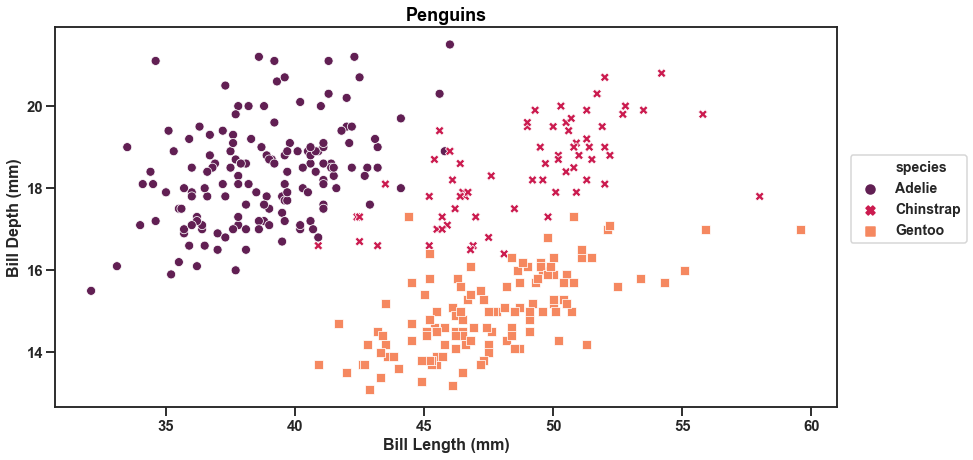
A few points to discuss:
sns.set_style() must be one of : 'white', 'dark', 'whitegrid', 'darkgrid', 'ticks'. This controls the plot area. Such as the color, grid and presence of ticks.
sns.set_context() must be one of: 'paper', 'notebook', 'talk', 'poster'. This controls the layout of the plot in terms of how it is to be read. Such as if it was on a 'poster' where we will see enlarged images and text. 'Talk' will create a plot with a more bold font.
We can see that with Seaborn we needed less lines of code to produce a beautiful graph with legend.
We will now try our hand at making subplots to represent each species using a different graph in the same plot.
Matplotlib code:
fig = plt.figure()

plt.rcParams['figure.figsize'] = [15,10]
plt.rcParams["font.weight"] = "bold"

fontdict={'fontsize': 25,
          'weight' : 'bold'}

fontdicty={'fontsize': 18,
          'weight' : 'bold',
          'verticalalignment': 'baseline',
          'horizontalalignment': 'center'}

fontdictx={'fontsize': 18,
          'weight' : 'bold',
          'horizontalalignment': 'center'}

plt.subplots_adjust(wspace=0.2, hspace=0.5)

fig.suptitle('Penguins', fontsize=25,fontweight="bold", color="black",
             position=(0.5,1.01))

#subplot 1
ax1 = fig.add_subplot(221)
ax1.scatter('bill_length_mm', 'bill_depth_mm', data=df[df['species']==1], c="skyblue")
ax1.set_title('Adelie', fontdict=fontdict, color="skyblue")
ax1.set_ylabel("Bill depth (mm)", fontdict=fontdicty, position=(0,0.5))
ax1.set_xlabel("Bill Length (mm)", fontdict=fontdictx, position=(0.5,0));

ax2 = fig.add_subplot(222)
ax2.scatter('bill_length_mm', 'bill_depth_mm', data=df[df['species']==2], c="yellowgreen")
ax2.set_title('Chinstrap', fontdict=fontdict, color="yellowgreen")
ax2.set_xlabel("Bill Length (mm)", fontdict=fontdictx, position=(0.5,0));


ax3 = fig.add_subplot(223)
ax3.scatter('bill_length_mm', 'bill_depth_mm', data=df[df['species']==3], c="darkgray")
ax3.set_title('Gentoo', fontdict=fontdict, color="darkgray")
ax3.set_ylabel("Bill depth (mm)", fontdict=fontdicty, position=(0,0.5))
ax3.set_xlabel("Bill Length (mm)", fontdict=fontdictx, position=(0.5,0));
Here we have created subplots representing each species. But the graphs don’t help us to make a comparison at first glance. That is because each graph has a varying x-axis. Let’s make it uniform.
Matplotlib code:
fig = plt.figure()

plt.rcParams['figure.figsize'] = [12,12]
plt.rcParams["font.weight"] = "bold"

plt.subplots_adjust(hspace=0.60)


fontdicty={'fontsize': 20,
          'weight' : 'bold',
          'verticalalignment': 'baseline',
          'horizontalalignment': 'center'}

fontdictx={'fontsize': 20,
          'weight' : 'bold',
          'horizontalalignment': 'center'}

fig.suptitle('Penguins', fontsize=25,fontweight="bold", color="black",
             position=(0.5,1.0))

#ax2 is defined first because the other plots are sharing its x-axis
ax2 = fig.add_subplot(412, sharex=ax2)
ax2.scatter('bill_length_mm', 'bill_depth_mm', data=df.loc[df['species']==2], c="skyblue")
ax2.set_title('Adelie', fontdict=fontdict, color="skyblue")
ax2.set_ylabel("Bill depth (mm)", fontdict=fontdicty, position=(-0.3,0.3))


ax1 = fig.add_subplot(411, sharex=ax2)
ax1.scatter('bill_length_mm', 'bill_depth_mm', data=df.loc[df['species']==1], c="yellowgreen")
ax1.set_title('Chinstrap', fontdict=fontdict, color="yellowgreen")


ax3 = fig.add_subplot(413, sharex=ax2)
ax3.scatter('bill_length_mm', 'bill_depth_mm', data=df.loc[df['species']==3], c="darkgray")
ax3.set_title('Gentoo', fontdict=fontdict, color="darkgray")
ax3.set_xlabel("Bill Length (mm)", fontdict=fontdictx);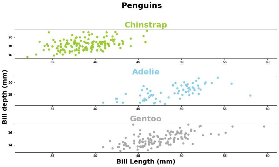
Let’s change the shape of the markers in the above graph to make it look more customised.
Matplotlib code:
fig = plt.figure()

plt.rcParams['figure.figsize'] = [15,10]
plt.rcParams["font.weight"] = "bold"

fontdict={'fontsize': 25,
          'weight' : 'bold'}

fontdicty={'fontsize': 18,
          'weight' : 'bold',
          'verticalalignment': 'baseline',
          'horizontalalignment': 'center'}

fontdictx={'fontsize': 18,
          'weight' : 'bold',
          'horizontalalignment': 'center'}

plt.subplots_adjust(wspace=0.2, hspace=0.5)

fig.suptitle('Penguins', fontsize=25,fontweight="bold", color="black",
             position=(0.5,1.01))

#subplot 1
ax1 = fig.add_subplot(221)
ax1.scatter('bill_length_mm', 'bill_depth_mm', data=df[df['species']==1], c="skyblue",marker='x')
ax1.set_title('Adelie', fontdict=fontdict, color="skyblue")
ax1.set_ylabel("Bill depth (mm)", fontdict=fontdicty, position=(0,0.5))
ax1.set_xlabel("Bill Length (mm)", fontdict=fontdictx, position=(0.5,0));

ax2 = fig.add_subplot(222)
ax2.scatter('bill_length_mm', 'bill_depth_mm', data=df[df['species']==2], c="yellowgreen",marker='^')
ax2.set_title('Chinstrap', fontdict=fontdict, color="yellowgreen")
ax2.set_xlabel("Bill Length (mm)", fontdict=fontdictx, position=(0.5,0));


ax3 = fig.add_subplot(223)
ax3.scatter('bill_length_mm', 'bill_depth_mm', data=df[df['species']==3], c="darkgray",marker='*')
ax3.set_title('Gentoo', fontdict=fontdict, color="darkgray")
ax3.set_ylabel("Bill depth (mm)", fontdict=fontdicty, position=(0,0.5))
ax3.set_xlabel("Bill Length (mm)", fontdict=fontdictx, position=(0.5,0));
We will create the same plot using Seaborn as well.
Seaborn code:
sns.set(rc={'figure.figsize':(20,20)})
sns.set_context('talk', font_scale=1)
sns.set_style('ticks')

g = sns.relplot(x='bill_length_mm', y='bill_depth_mm', hue='sex', data=df,palette="rocket",
                legend='full',col='species', col_wrap=2,
                height=4, aspect=1.6, sizes=(800,800))

g.fig.suptitle('Penguins',position=(0.5,1.05), fontweight='bold', size=20)
g.set_xlabels("Bill Length (mm)",fontweight='bold', size=15)
g.set_ylabels("Bill Depth (mm)",fontweight='bold', size=15);
Notice that here the subplots representing the species are further divided into two classes i.e. Male and Female. Again we can notice how Seaborn stands out to be superior by producing a better graph with a few lines of code.
We can also add different markers for each species in the above graph. Let’s do that.
Seaborn code:
sns.set(rc={'figure.figsize':(20,20)})
sns.set_context('talk', font_scale=1)
sns.set_style('ticks')
g = sns.relplot(x='bill_length_mm', y='bill_depth_mm', hue='species', data=df,palette="rocket",
                col='species', col_wrap=4, legend='full',
                height=6, aspect=0.5, style='species', sizes=(800,1000))

g.fig.suptitle('Penguins' ,position=(0.4,1.05), fontweight='bold', size=20)
g.set_xlabels("Bill Length (mm)",fontweight='bold', size=15)
g.set_ylabels("Bill Depth (mm)",fontweight='bold', size=15);
In a similar fashion as shown above, we can make the subplots share the same y-axis instead of sharing the same x-axis. The following plots represent the same.
Matplotlib code:
fig = plt.figure()

plt.rcParams['figure.figsize'] = [12,12]
plt.rcParams["font.weight"] = "bold"

plt.subplots_adjust(hspace=0.60)


fontdicty={'fontsize': 20,
          'weight' : 'bold',
          'verticalalignment': 'baseline',
          'horizontalalignment': 'center'}

fontdictx={'fontsize': 20,
          'weight' : 'bold',
          'horizontalalignment': 'center'}

fig.suptitle('Penguins', fontsize=25,fontweight="bold", color="black",
             position=(0.5,1.0))

#ax2 is defined first because the other plots are sharing its x-axis
ax2 = fig.add_subplot(141, sharex=ax2)
ax2.scatter('bill_length_mm', 'bill_depth_mm', data=df.loc[df['species']==2], c="skyblue")
ax2.set_title('Adelie', fontdict=fontdict, color="skyblue")
ax2.set_ylabel("Bill depth (mm)", fontdict=fontdicty, position=(-0.3,0.5))


ax1 = fig.add_subplot(142, sharex=ax2)
ax1.scatter('bill_length_mm', 'bill_depth_mm', data=df.loc[df['species']==1], c="yellowgreen")
ax1.set_title('Chinstrap', fontdict=fontdict, color="yellowgreen")


ax3 = fig.add_subplot(143, sharex=ax2)
ax3.scatter('bill_length_mm', 'bill_depth_mm', data=df.loc[df['species']==3], c="darkgray")
ax3.set_title('Gentoo', fontdict=fontdict, color="darkgray")
ax3.set_xlabel("Bill Length (mm)", fontdict=fontdictx,position=(-0.7,0));

Seaborn code:
sns.set(rc={'figure.figsize':(20,20)})
sns.set_context('talk', font_scale=1)
sns.set_style('ticks')
g = sns.relplot(x='bill_length_mm', y='bill_depth_mm', hue='species', data=df,palette="rocket",
                col='species', col_wrap=4, legend='full',
                height=6, aspect=0.5, style='species', sizes=(800,1000))

g.fig.suptitle('Penguins' ,position=(0.4,1.05), fontweight='bold', size=20)
g.set_xlabels("Bill Length (mm)",fontweight='bold', size=15)
g.set_ylabels("Bill Depth (mm)",fontweight='bold', size=15);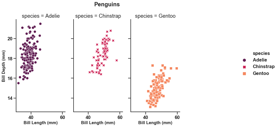
So, this is how you can create subplots. It can be done with any other kind of graphs as well such as line graphs, histograms etc. Let us try our hand at different kinds of graphs for visualization.
Line plot
For plotting this kind of graph we will create some random data using numpy and random libraries.
Code for creating data:
import numpy as np
from random import *

rng = np.random.RandomState(0)
x = np.linspace(0, 10, 8)
y = np.cumsum(rng.randn(8, 8), 0)
Matplotlib code:
plt.figure(figsize=(14,7))
plt.plot(x, y)
plt.legend('ABCDEF', ncol=2, loc='upper left');
The same matplotlib code with seaborn overwriting matplotlib’s default parameters to generate a more pleasing graph.
Seaborn code:
sns.set(rc={'figure.figsize':(14,7)})
sns.set_context('talk', font_scale=0.9)
sns.set_style('darkgrid')

plt.plot(x, y)
plt.legend('ABCDEF', ncol=2, loc='upper left');
To enhance the graph we could include markers this way:
Code:
sns.set(rc={'figure.figsize':(14,7)})
sns.set_context('talk', font_scale=0.9)
sns.set_style('darkgrid')

plt.plot(x, y, marker='o')
plt.legend('ABCDEF', ncol=2, loc='upper left');
To make each line distinct we can add different makers along different lines the following way.
Code:
sns.set(rc={'figure.figsize':(14,7)})
sns.set_context('talk', font_scale=0.9)
sns.set_style('darkgrid')
L=[]


for j in range(len(y)):
    l=[]
    for i in y:
        l.append(i[j])
    L.append(l)

plt.plot(x, L[0], marker='o',label='A')
plt.plot(x, L[1], marker='^',label='B')
plt.plot(x, L[2], marker='s',label='C')
plt.plot(x, L[3], marker='D',label='D')
plt.plot(x, L[4], marker='*',label='E')
plt.plot(x, L[5], marker='+',label='F')
plt.legend(ncol=2,loc='lower left');
Notice that we have now altered the position of the legend in the graph.
Bar graphs
For playing around with such graphs we will be using 'titanic' dataset available in Seaborn library. The dataset contains details like age, sex, class, fare,embark_town, survived or not etc of people aboard the titanic.
Let's begin. We will be plotting the graph showing the count of 'survival' or 'no survival' for different classes of people. We will convert the dataset into a pandas dataframe.
Code for dataset:
df2 = sns.load_dataset("titanic")
df2.head()

First= df2[df2['class']=='First']['survived'].value_counts()
Second= df2[df2['class']=='Second']['survived'].value_counts()
Third=df2[df2['class']=='Third']['survived'].value_counts()
df3 = pd.DataFrame([First,Second,Third])
df3.index=['First','Second','Third']
Matplotlib code:
df3.plot(kind='bar',figsize=(14,7),title='Titanic survial on basis of class',cmap='Set2')
plt.show()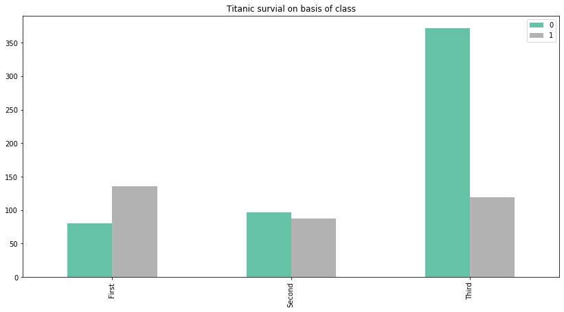
Note that here we have two separate colored bars to represent the 'survived' column of the data. A value of '0' represents 'not survived' and a value of '1' represents 'survived'. We can clearly make the observation that the most people who did not survive were from the 'Third' class.
Coming back to the graph. We can make it look more attractive by changing the default parameters.
We can change the orientation of the xticks and y ticks of the graph and we can add annotation to it as well to make the graph easily understandable.
Code:
ax= df3.plot(kind='bar',figsize=(14,7), title='Titanic survial on basis of class',cmap='Set2')
plt.xticks(rotation=20)
plt.yticks(rotation=20)

for i in ax.patches:
    # get_x pulls left or right; get_height pushes up or down
    ax.text(i.get_x()+0.07, i.get_height()+5, \
            str(round((i.get_height()), 2)), fontsize=11, color='steelblue')
plt.show()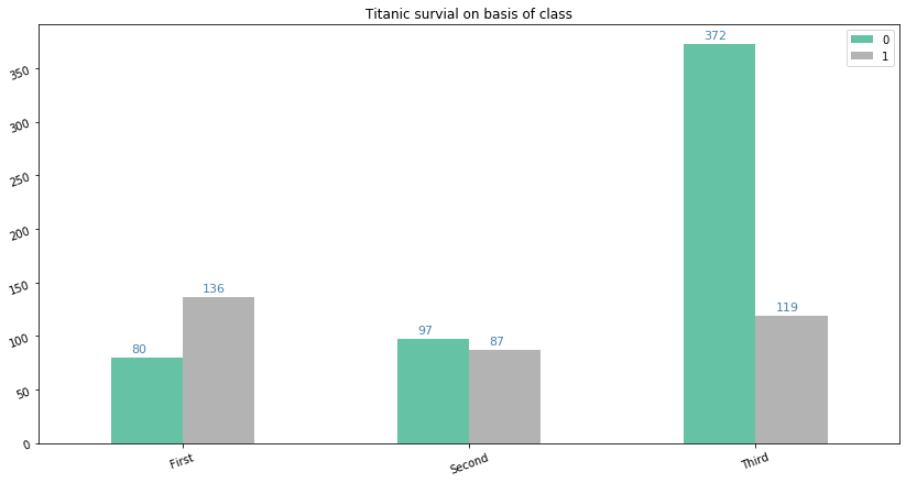
To add more to it we can also include some design in the bars to make them look more stylish. This is done by using the parameter 'hatch'. Also we will be tilting the annotation to add in one more difference to the graph.
Code:
ax= df3.plot(kind='bar',figsize=(14,7), title='Titanic survial on basis of class',cmap='Set2',hatch='|',edgecolor='aliceblue')
plt.xticks(rotation=20)

for i in ax.patches:
    # get_x pulls left or right; get_height pushes up or down
    ax.text(i.get_x()+0.07, i.get_height()+5, \
            str(round((i.get_height()), 2)), fontsize=11, color='steelblue',
                rotation=45)
plt.show()
Moreover, we can also go further and can change the hatch design for the two different bars as shown below.
Code:
ax= df3.plot(kind='bar',figsize=(14,7), title='Titanic survial on basis of class',cmap='Set2',hatch='O',edgecolor='aliceblue')
plt.xticks(rotation=20)
plt.yticks(rotation=20)

bars = ax.patches
patterns = ['/', '.']  # set hatch patterns in the correct order
hatches = []  # list for hatches in the order of the bars
for h in patterns:  # loop over patterns to create bar-ordered hatches
    for i in range(int(len(bars) / len(patterns))):
        hatches.append(h)
for bar, hatch in zip(bars, hatches):  # loop over bars and hatches to set hatches in correct order
    bar.set_hatch(hatch)
# generate legend. this is important to set explicitly, otherwise no hatches will be shown!

for i in ax.patches:
    # get_x pulls left or right; get_height pushes up or down
    ax.text(i.get_x()+0.07, i.get_height()+5, \
            str(round((i.get_height()), 2)), fontsize=11, color='steelblue')
ax.legend()
plt.show()
You can also give each bar its unique hatch design by adding as many hatches as bars in the 'patterns' list. Go ahead and give it a try.
In addition, we can also have this bar graph in a horizontal orientation. The only change is that we will be using the parameter 'kind' equal to 'barh' instead of 'bar' while plotting.
Code:
ax= df3.plot(kind='barh',figsize=(14,7), title='Titanic survial on basis of class',cmap='Set2',hatch='O',edgecolor='aliceblue')
plt.xticks(rotation=20)
plt.yticks(rotation=20)

bars = ax.patches
patterns = ['/', '.']  # set hatch patterns in the correct order
hatches = []  # list for hatches in the order of the bars
for h in patterns:  # loop over patterns to create bar-ordered hatches
    for i in range(int(len(bars) / len(patterns))):
        hatches.append(h)
for bar, hatch in zip(bars, hatches):  # loop over bars and hatches to set hatches in correct order
    bar.set_hatch(hatch)
# generate legend. this is important to set explicitly, otherwise no hatches will be shown!

ax.legend()
plt.show()

We can also transform the graph into a stacked graph as shown below.
Code:
ax= df3.plot(kind='bar',figsize=(14,7), title='Titanic survial on basis of class',cmap='Set2',hatch='O',edgecolor='aliceblue',stacked=True)
plt.xticks(rotation=20)
plt.yticks(rotation=20)

bars = ax.patches
patterns = ['/', '.']  # set hatch patterns in the correct order
hatches = []  # list for hatches in the order of the bars
for h in patterns:  # loop over patterns to create bar-ordered hatches
    for i in range(int(len(bars) / len(patterns))):
        hatches.append(h)
for bar, hatch in zip(bars, hatches):  # loop over bars and hatches to set hatches in correct order
    bar.set_hatch(hatch)
ax.legend()
plt.show()
Creating the same bar plot using Seaborn. Here we will be using countplot method of Seaborn as it serves our purpose well and tremendously reduces our lines of code. You will notice that here we don't need to create another dataframe using the original dataframe to create this plot.
Seaborn code:
sns.set(palette='dark')
bar=sns.countplot(x='class', hue= 'survived', data=df2)
plt.xticks(rotation=20)
plt.yticks(rotation=20)
for p in bar.patches:
    bar.annotate(format(p.get_height(), '.2f'), (p.get_x() + p.get_width() / 2., p.get_height()), ha = 'center', va = 'center',
             xytext = (0, 10), textcoords = 'offset points')


# Define some hatches
hatches = ['-', '-', '-', '\\', '\\', '\\']

# Loop over the bars
for i,thisbar in enumerate(bar.patches):
    # Set a different hatch for each bar
    thisbar.set_hatch(hatches[i])

plt.show()
To generate a horizontal graph:
Seaborn code:
sns.set(palette='dark')
bar=sns.countplot(y='class', hue= 'survived', data=df2)
plt.xticks(rotation=20)
plt.yticks(rotation=20)

# Define some hatches
hatches = ['-', '-', '-', '\\', '\\', '\\']

# Loop over the bars
for i,thisbar in enumerate(bar.patches):
    # Set a different hatch for each bar
    thisbar.set_hatch(hatches[i])

plt.show()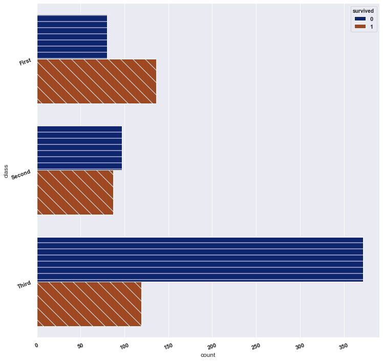
Unfortunately, seaborn is not so fond of stacked bar graphs and thus plotting stacked bar graph isn't as smooth, though there are ways to get around it which we won't b e discussing here. Try it out yourself.
Histograms
We will continue using the same dataset as above. First we will make a histogram using matplotlib and then using seaborn.
Matplotlib code:
df2=df2.dropna()
plt.figure(figsize=(14,7))
plt.hist(df2['fare'])
plt.xlabel('Fare',fontsize=20)
plt.ylabel('values', fontsize=20)
plt.show()
We can also make multiple histograms in the same graph as follows.
code:
df2[['fare','age','pclass']].plot.hist(stacked=True, bins=30, figsize=(14,7))
plt.xlabel('Fare',fontsize=20)
plt.ylabel('values', fontsize=20)
plt.show()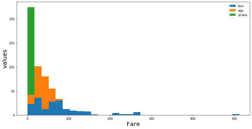
Now, with seaborn we can create the same graphs but much better.
Seaborn code:
sns.set(style='dark')
plt.figure(figsize=(14,7))

sns.distplot(df2['fare'],kde=False)
plt.xlabel('Fare',fontsize=20)
plt.ylabel('values', fontsize=20)
plt.show()
We can also add a line outline the histogram. It is called a kernel density plot and can be displayed by setting the option 'kde' to True.
code:
sns.set(style='dark')
plt.figure(figsize=(14,7))

sns.distplot(df2['fare'],kde=True)
plt.xlabel('Fare',fontsize=20)
plt.ylabel('values', fontsize=20)
plt.show()
Multiple hisotgrams:
Seaborn code:
sns.set(style='dark')
fig, ax = plt.subplots(figsize=(14,7))

for a in ['fare','age','pclass']:
    sns.distplot(df2[a], bins=range(1, 110, 10), ax=ax, kde=False,label=a)

plt.xlabel('Fare',fontsize=20)
plt.ylabel('values', fontsize=20)
plt.legend()
plt.show()
The bars are slightly transparent which lets us compare them easily.
Boxplots
We will continue with the same dataset with slight modifications. A basic boxplot looks like something as shown below.
code:
Female= df2[df2['sex']=='female']['age']
Male= df2[df2['sex']=='male']['age']
df3 = pd.DataFrame([Female, Male])
df3.index=['Female','Male']
df3=df3.T
Matplotlib code:
plt.figure(figsize=(14,7))
plt.boxplot([df2['age'],df2['fare']],labels=['age','fare'])
plt.show()
We can add a notch to the boxplot by setting the parameter with the same name as True. An example is shown below.
Matplotlib code:
plt.figure(figsize=(14,7))
plt.boxplot([df2['age'],df2['fare']],labels=['age','fare'],notch=True)
plt.show()

See the difference, to enhance it even further we can also change the shape and color of the outliers.
Matplotlib code:
plt.figure(figsize=(14,7))
green_diamond = dict(markerfacecolor='g', marker='D')
plt.boxplot([df2['age'],df2['fare']],labels=['age','fare'],notch=True ,flierprops=green_diamond)
plt.show()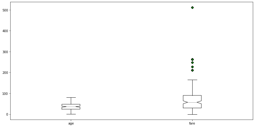
Moving on with seaborn.
code:
sns.set(style='dark')
df3=df2[['age','fare']]
plt.figure(figsize=(14,7))
sns.boxplot(data=df3)

plt.show()
There is no way to change the outlier design but it still looks cool. But there are other benefits to using seaborn for example we can add easily add hue to the graphs and can get more insight from the data. Let's try it.
Seaborn code:
plt.figure(figsize=(14,7))
sns.boxplot(x='sex', y='age', data=df2, hue="survived")
plt.show()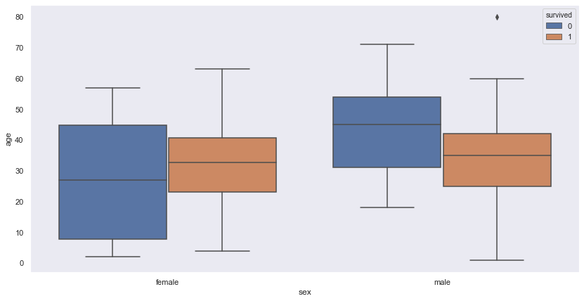
Similarly we can create violin plots, strip plots and swarm plots. Out of these only violin plots can be created using matplotlib rest are the features specific to seaborn. Hence, to be quick we will create these plots using seaborn only.
Violinplots
A basic violinplot.
seaborn code:
sns.set(style='dark')
df3=df2[['age','fare']]
plt.figure(figsize=(14,7))
sns.violinplot(data=df3,palette='rocket')

plt.show()
A plot with hue.
seaborn code:
sns.set(style='dark')
plt.figure(figsize=(14,7))
sns.violinplot(x='sex', y='age', data=df2, hue='survived',palette='rocket')
plt.show()
A variation of the above plot.
seaborn code:
sns.set(style='dark')
plt.figure(figsize=(14,7))
sns.violinplot(x='sex', y='age', data=df2, hue='survived',palette='rocket', split=True)
plt.show()

This change is introduced by adding the parameter 'split' in the code.
Stripplot
A basic stripplot.
Seaborn code:
sns.set(style='dark')
plt.figure(figsize=(12,6))
sns.stripplot(x='sex', y='age', data=df2, palette='rocket',jitter=False)
plt.show()
The above plot isn't that much comprehensible, the dsitribution of the data remains ambiguous. To get some more insight we can set the jitter option to be set True as shown below.
Seaborn code:
sns.set(style='dark')
plt.figure(figsize=(14,7))
sns.stripplot(x='sex', y='age', data=df2, palette='rocket',jitter=True)
plt.show()
To enhance the plot further we can add hue to it as well.
Seaborn code:
sns.set(style='dark')
plt.figure(figsize=(14,7))
sns.stripplot(x='sex', y='age', data=df2, jitter=True, hue='survived',palette='rocket')
plt.show()
Swarmplot
A basic swarm plot.
Seaborn code:
df4 = sns.load_dataset("titanic")
df4.head()

sns.set(style='dark')
plt.figure(figsize=(14,7))
sns.swarmplot(x='sex', y='age', data=df4,palette='rocket',dodge=False)
plt.show() 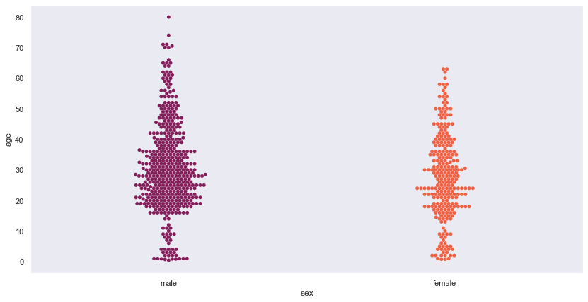
A swarm plot withe hue.
Seaborn code:
sns.set(style='dark')
plt.figure(figsize=(14,7))
sns.swarmplot(x='sex', y='age', data=df4, hue='survived',dodge=False, palette='rocket')
plt.show()
We can also split swarm plots as we did ealier with the boxplot and the vioilin plot
Seaborn code:
sns.set(style='dark')
plt.figure(figsize=(14,7))
sns.swarmplot(x='sex', y='age', data=df4, hue='survived', dodge=True, palette='rocket')
plt.show()
Pie chart
For this chart we will changing our dataset. We will be using a supermarket dataset named 'SampleSuperstore.csv'.
A very basic pie chart is as follows.
Matplotlib code:
plt.figure(figsize=(16,10))
raw_data['Category'].value_counts().plot.pie()
plt.show()
To make it look better we can add some shadow to each pie slice. Also we can explode the chart as well. Let us see what I meant by this.
Matplotlib code:
plt.figure(figsize=(16,10))
raw_data['Category'].value_counts().plot.pie(shadow=True,autopct="%1.1f%%",explode = (0, 0.1, 0))
plt.legend()
plt.show()
Here we have exploded only one slice. We can do this for all the slices by changing the values in the tuple assigned to the parameter explode.
We would have made Pie charts using Seaborn but this feature isn't available in it.
Donut plot
This will be the last plot of this blog. We will generate this graph by creating our own data.
Code:
plt.figure(figsize=(16,10))
names='Tim', 'Robbie', 'Mark', 'Harry',
number=[160,12,75,200]

my_circle=plt.Circle( (0,0), 0.7, color='white')

plt.pie(number, labels=names, colors=['red','green','blue','skyblue'])
p=plt.gcf()
p.gca().add_artist(my_circle)
plt.show()
There are endless possibilities to explore in terms of data visualisation. This blog will stop here but you can keep trying to get better results by experimenting. Good luck with exploring.


Comments